Domina
Status: Finished
Concept:
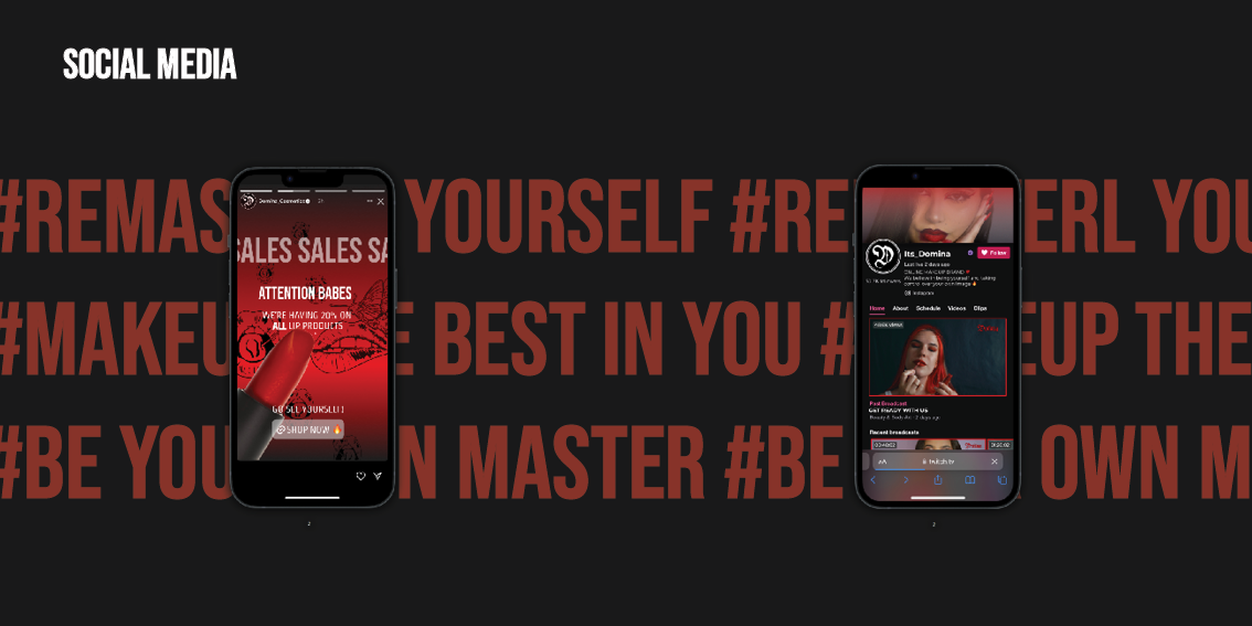
An edgy, bold online makeup brand that specializes in shades of reds, and offers all types of beauty products – makeup, nail products, accessories, hair products and merchandize of course. The brand focuses on self expression, bravery and standing out, and also challenges nowadays beauty standards.
An edgy, bold online makeup brand that specializes in shades of reds, and offers all types of beauty products – makeup, nail products, accessories, hair products and merchandize of course. The brand focuses on self expression, bravery and standing out, and also challenges nowadays beauty standards.
Target audience:
The target audience ages are between 18 and 30. Domina Cosmetics is for people from both genders, who like expressing themselves boldly. Either experienced creative makeup users or ones that want to get into makeup and try something new.
The target audience ages are between 18 and 30. Domina Cosmetics is for people from both genders, who like expressing themselves boldly. Either experienced creative makeup users or ones that want to get into makeup and try something new.
Brand strategy:
VISION - To create a more innovative, daring and empowering makeup space.
MISSION - By creating the largest spectrum of red shades we allow people to express themselves in a bold and unique way.
POSITIONING - An online makeup brand that specializes in reds that allows to stand out and get creative.
ESSENCE - Taking control over your own image! Making a statement, getting creative.
PROMISE - We promise to help anyone find the shades and looks that will be the most useful for their self expression and give a special buying experience.
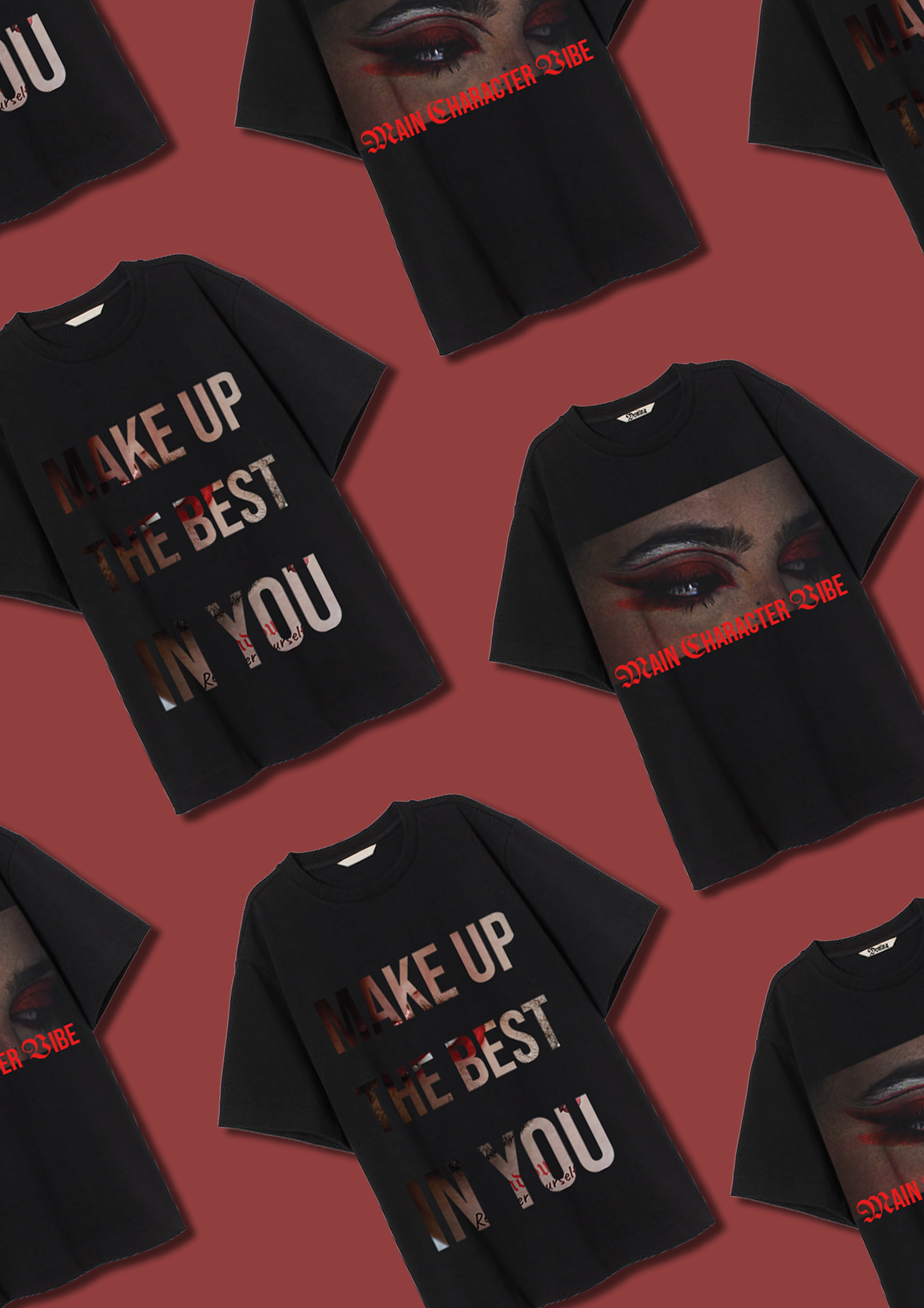
SLOGAN - Make up the best in you, be your own master.
Logo and brand identity:
Domina promotes certain ideas, such as erasing classic beauty standards, daring to be yourself and showing that to the world by that gaining confidence. Domina is a brand that gives the stage to anyone - from any gender or color, with different weight and features. In order to showcase that I decided to go for a typographical logo, that won't take the focus off of the visual parts of the brand but will have a bold enough presence. That's why I modified a gothic font.
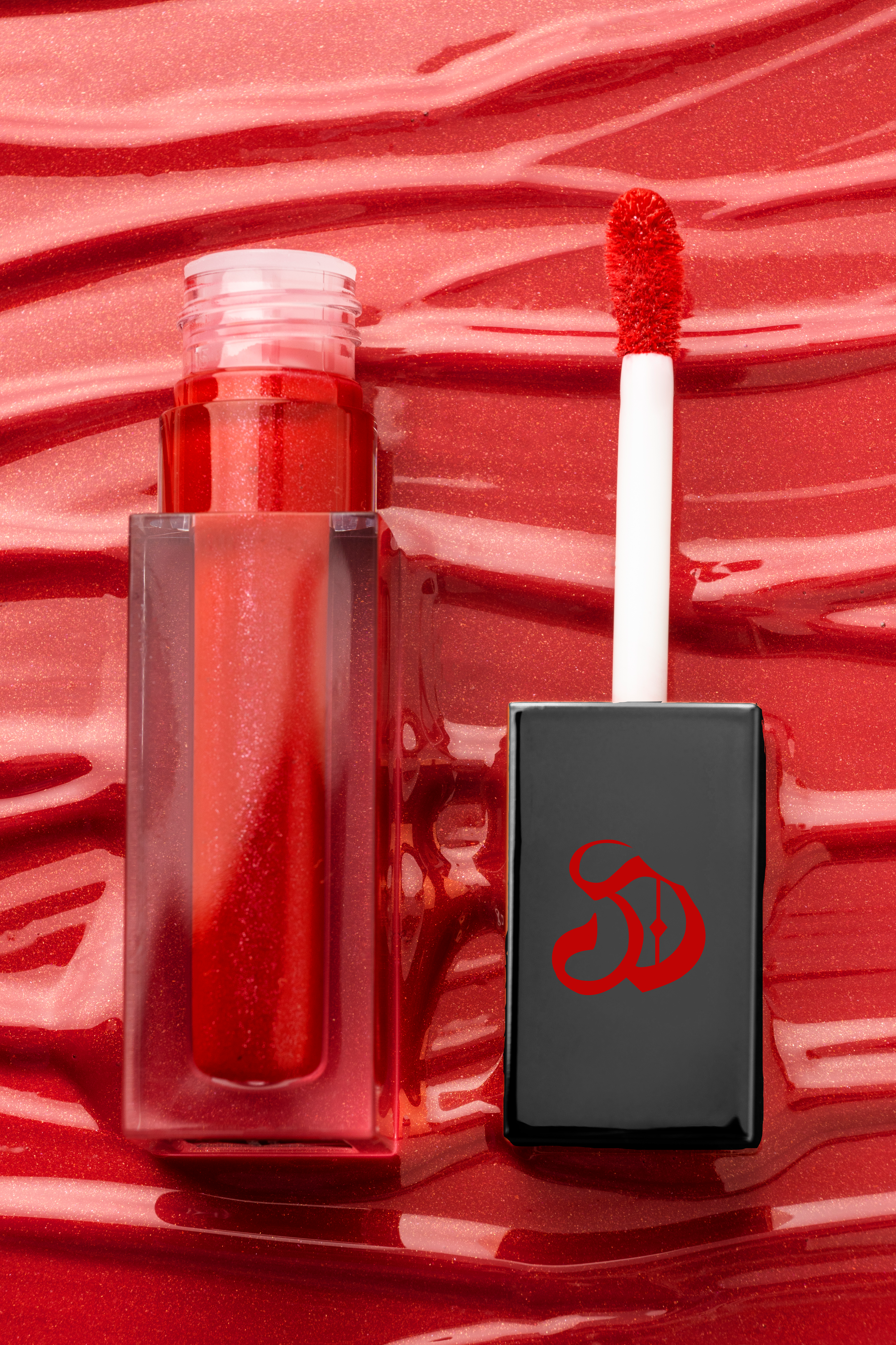
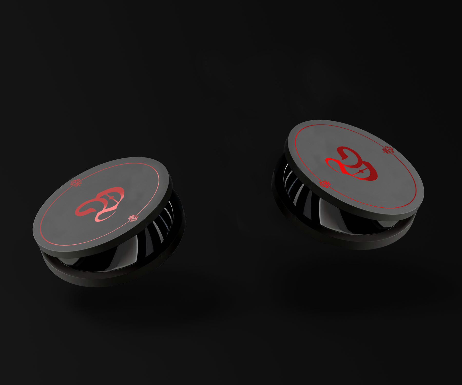
There are actually 2 versions of the logo. The full version - which is the name of the brand, and since makeup products are small - a short version, just the first letter, that will be a more compact one.
Visual Elements:
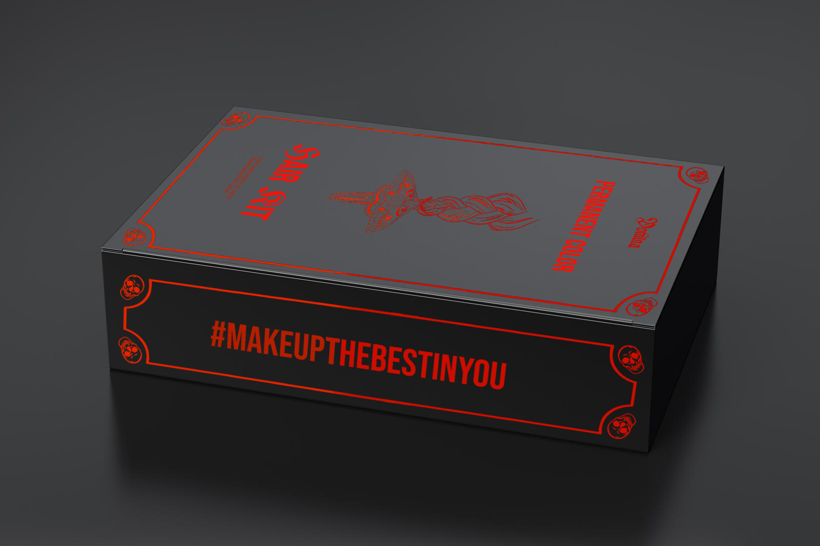
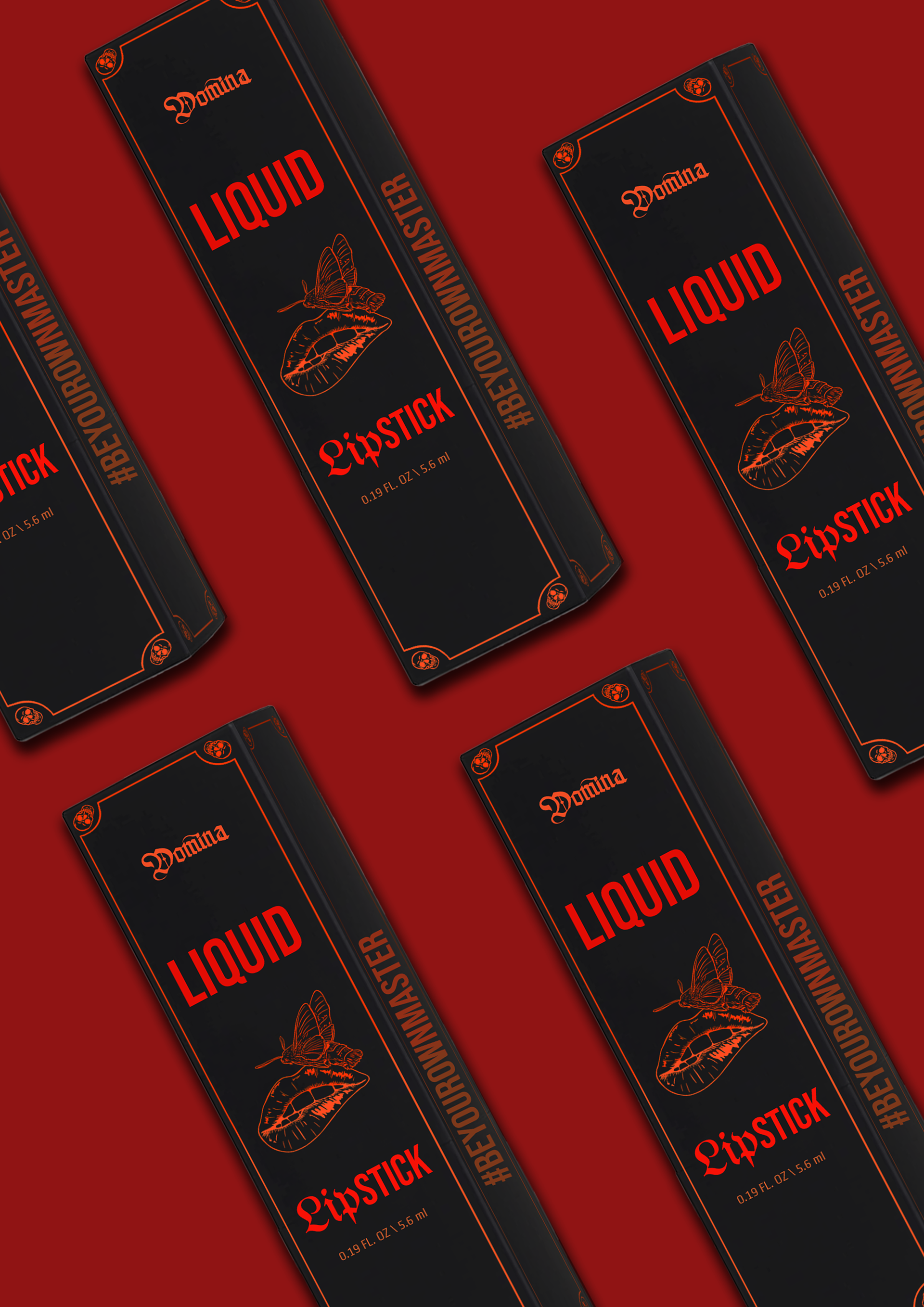
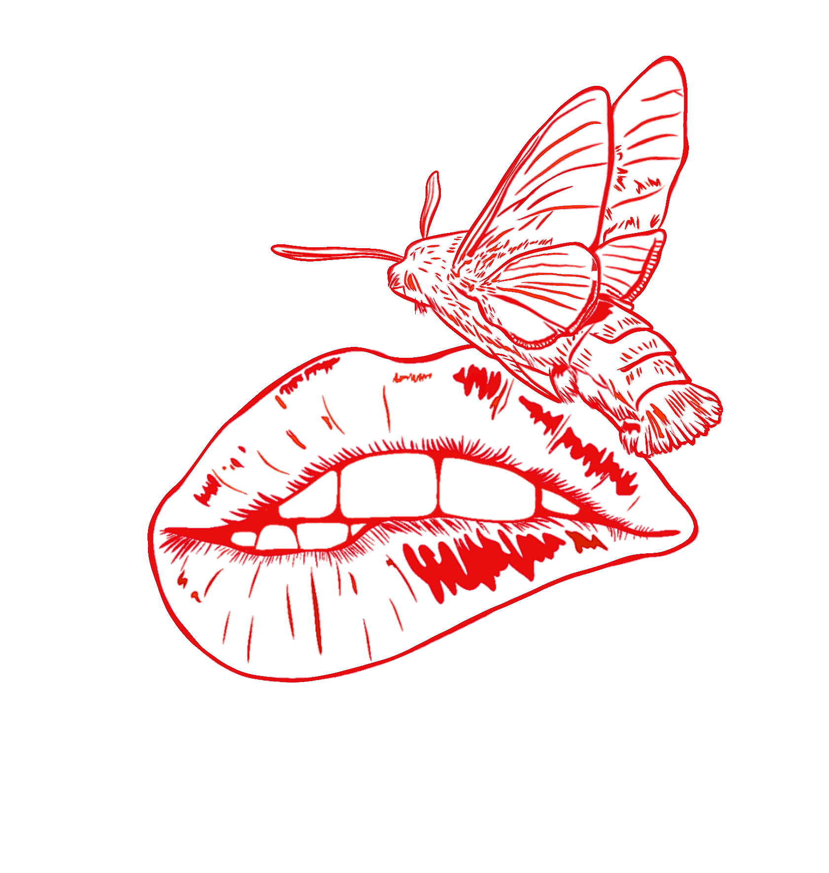
The main elements of the brand are original photography and illustrations. Since the brand has 6 main categories of products, there is a set of illustrations for each one of them. The illustrations appear on the products packages (for example, on all of the lips packages the lips illustration is used). The same illustrations represent the categories in the website. In every illustration there is a combination of a body part that represents the category and a moth. Moth is a symbol of death and rebirth, which in this case represents the rebirth of the persona and the essence of the computer after using the product. Some other ones can also be seen as patterns.
The main elements of the brand are original photography and illustrations. Since the brand has 6 main categories of products, there is a set of illustrations for each one of them. The illustrations appear on the products packages (for example, on all of the lips packages the lips illustration is used). The same illustrations represent the categories in the website. In every illustration there is a combination of a body part that represents the category and a moth. Moth is a symbol of death and rebirth, which in this case represents the rebirth of the persona and the essence of the computer after using the product. Some other ones can also be seen as patterns.
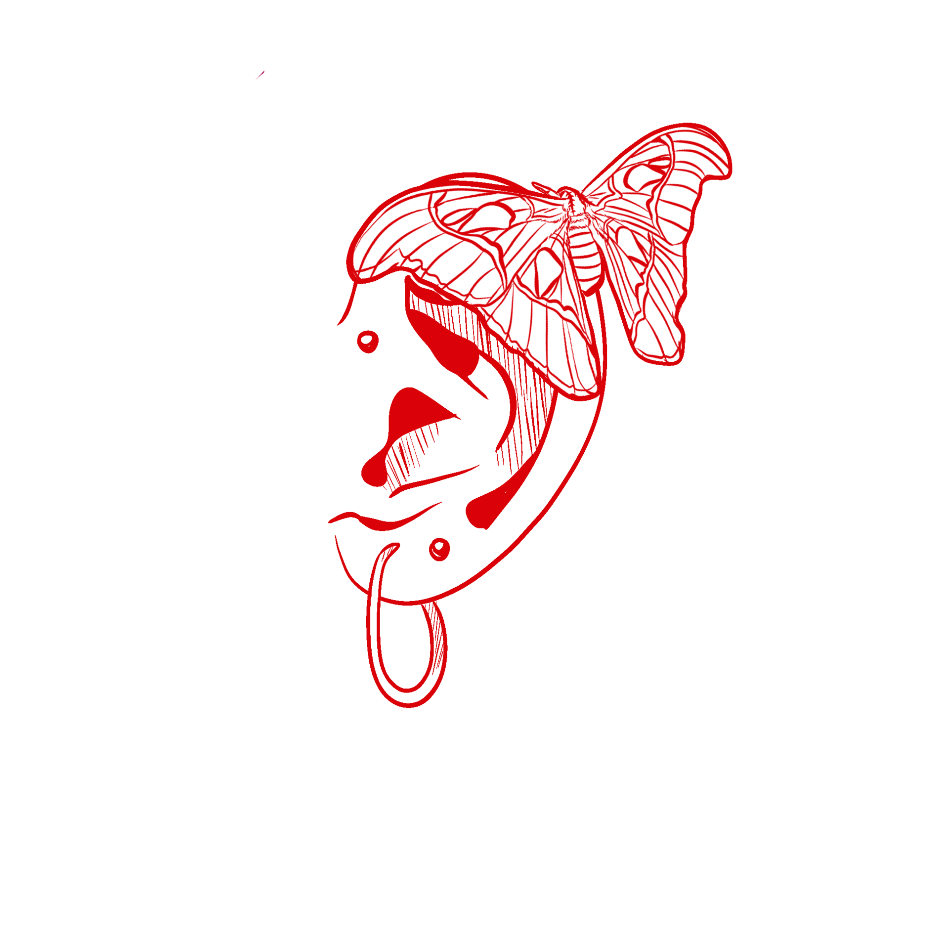
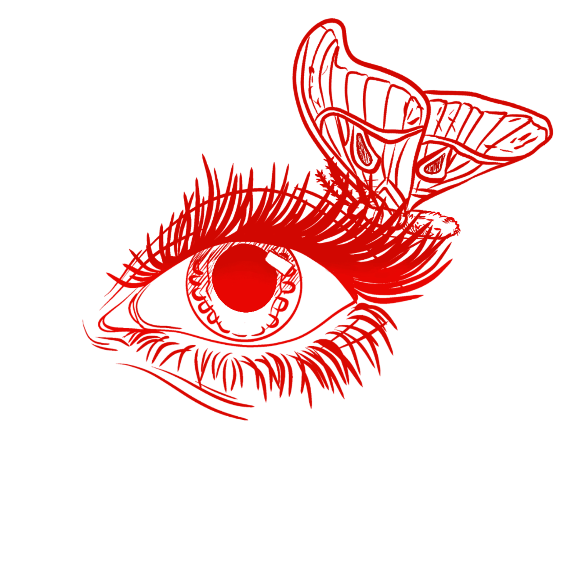
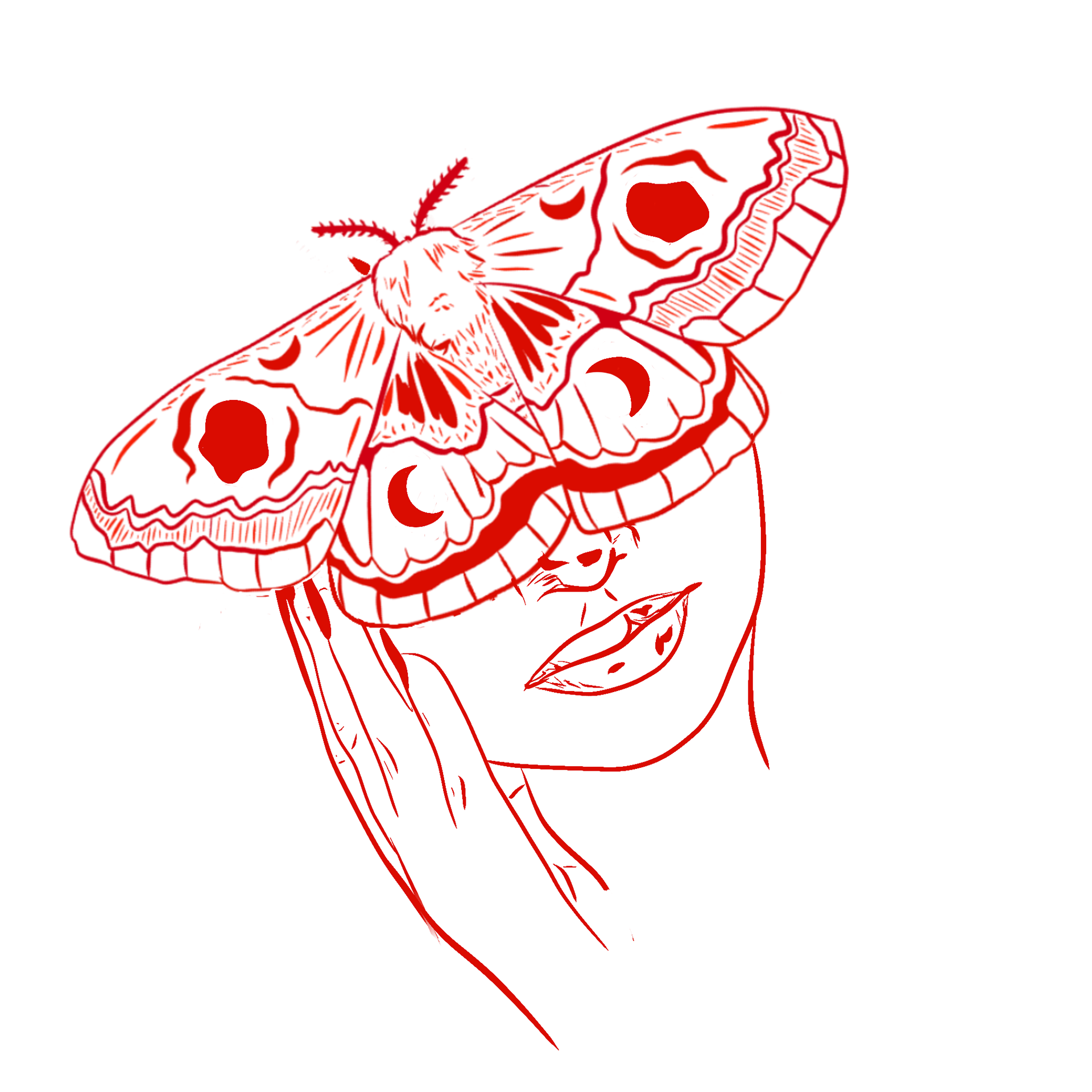
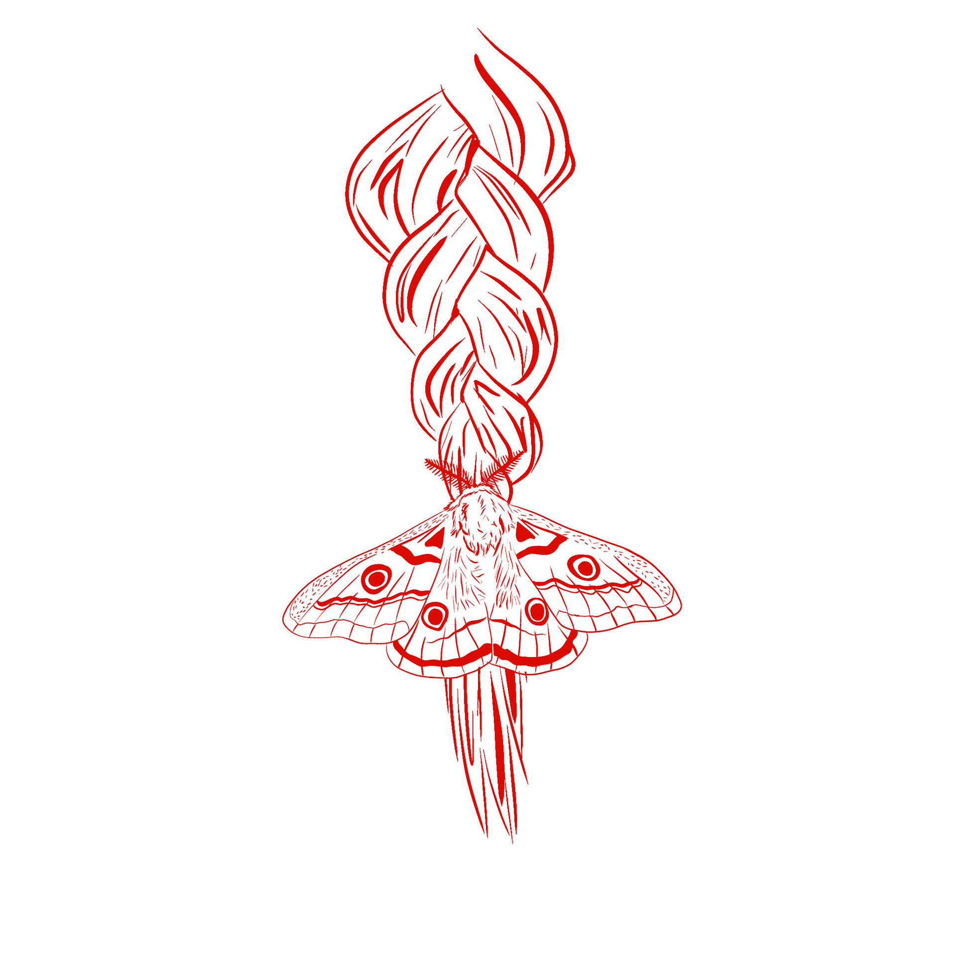
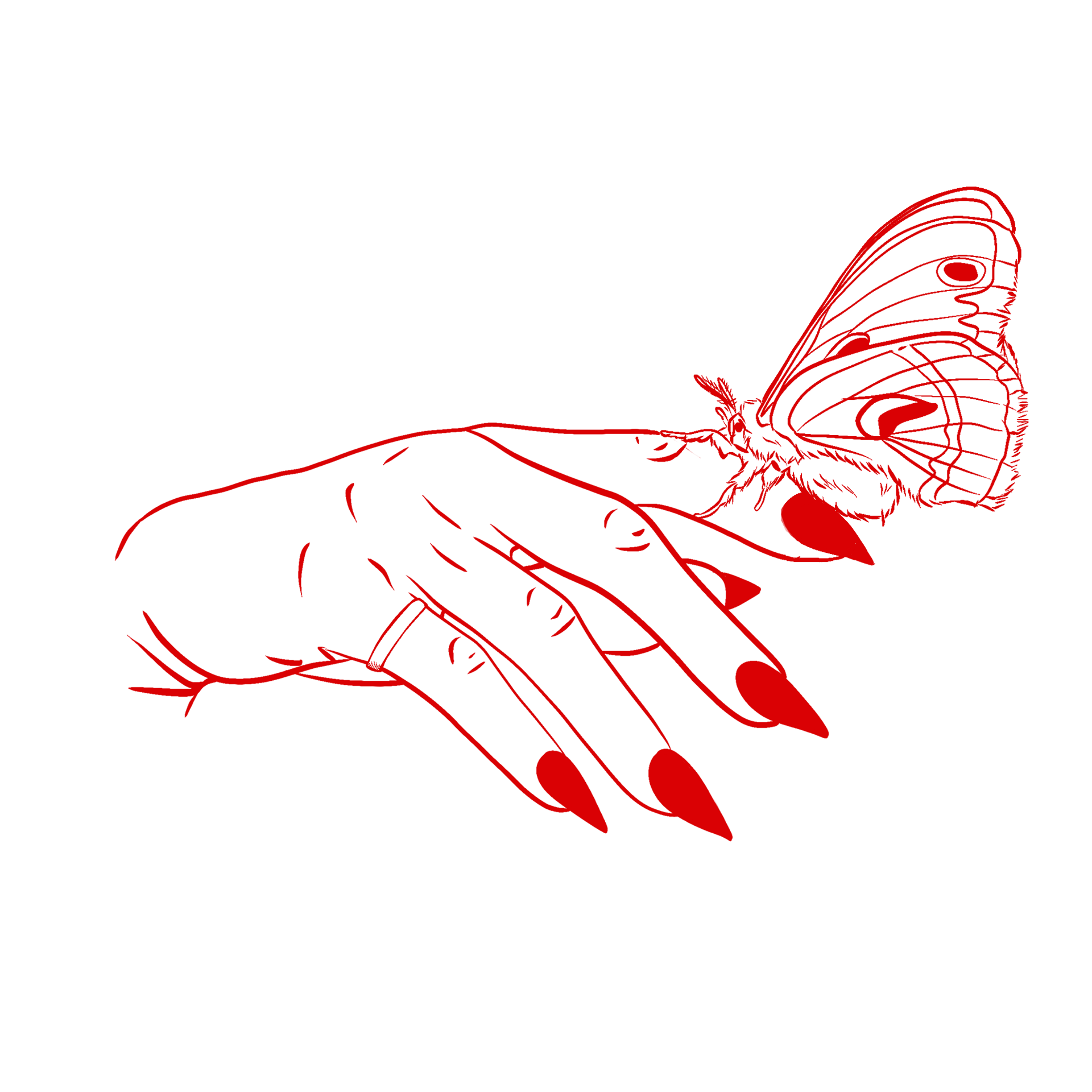
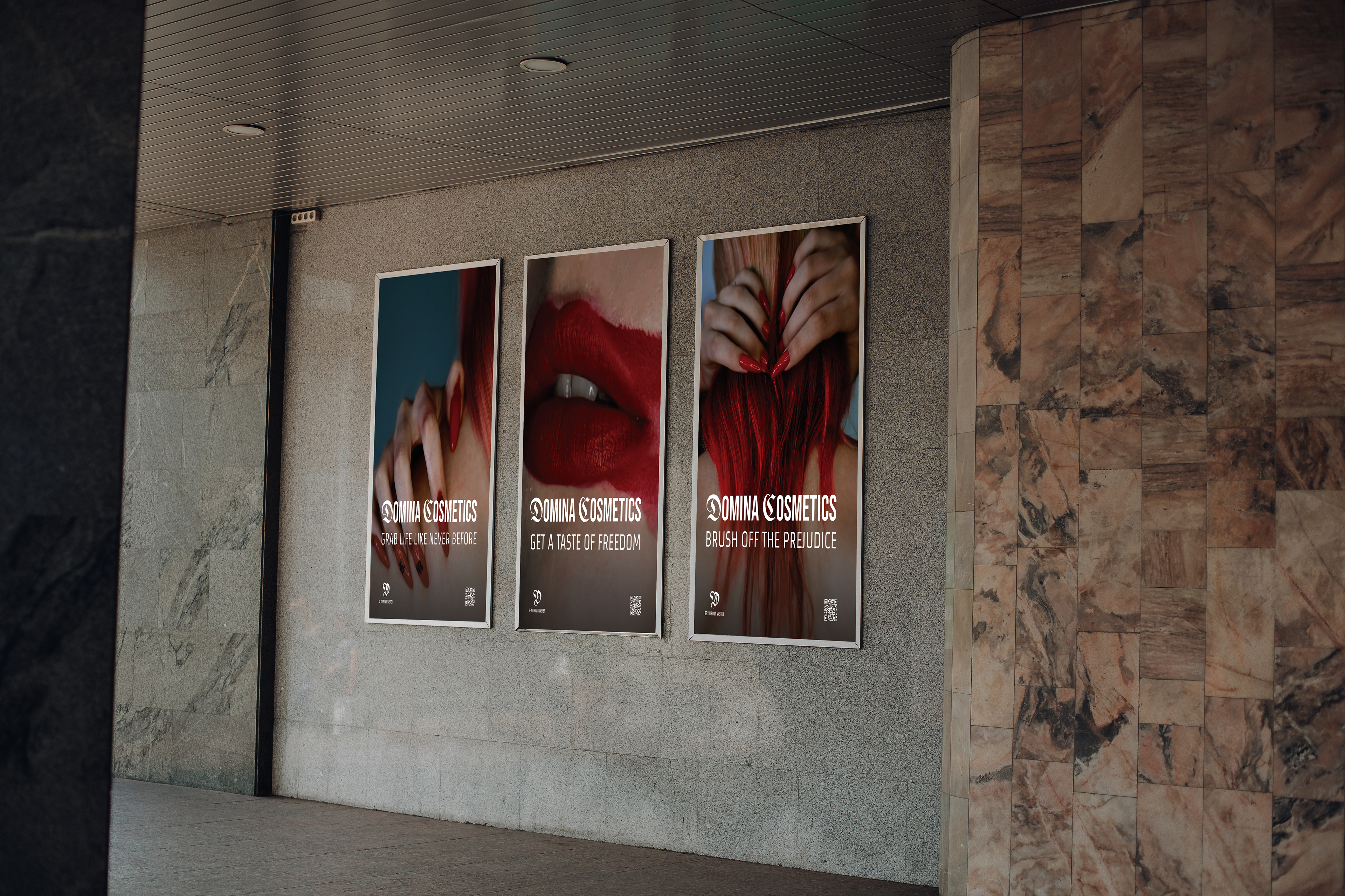
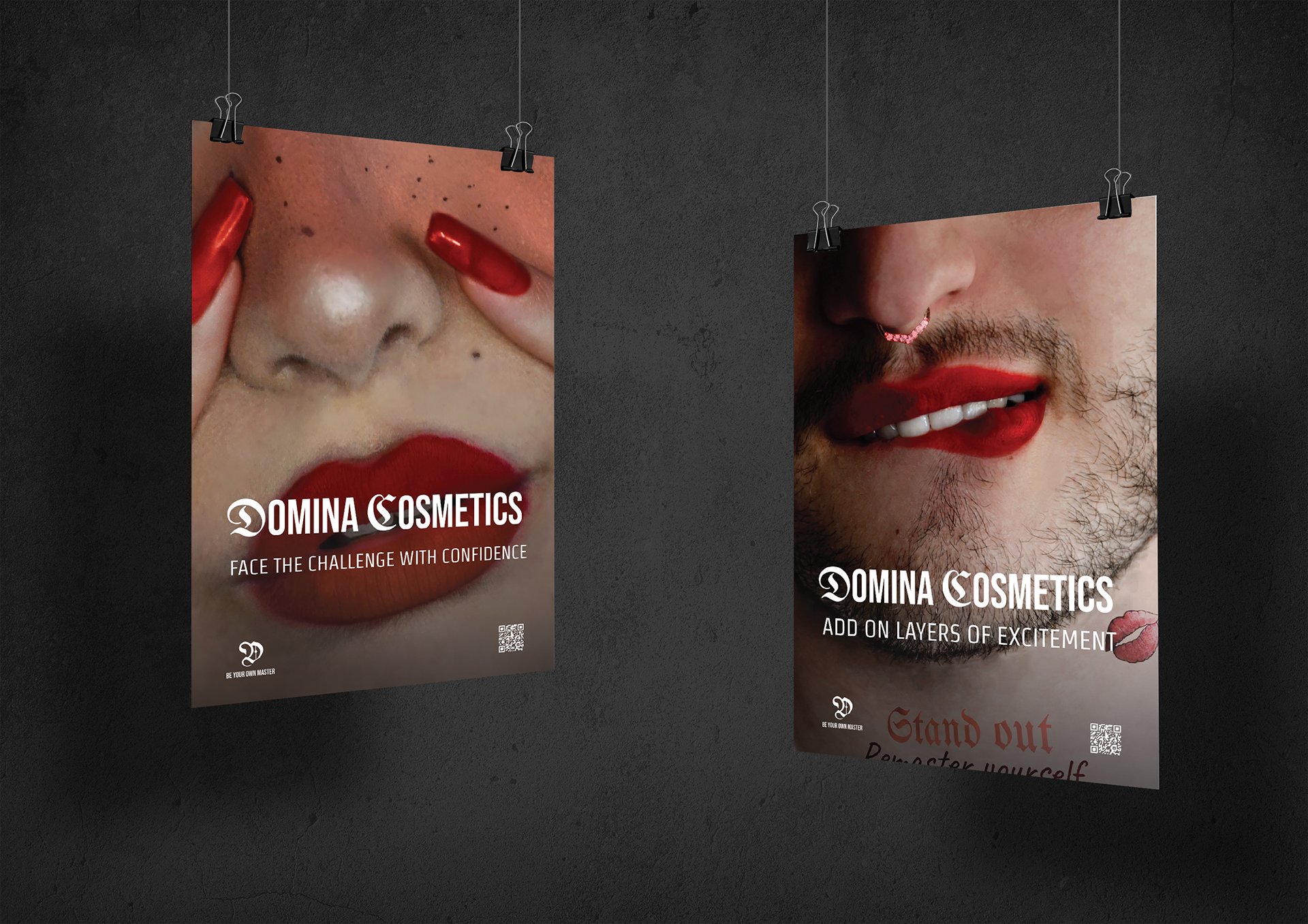
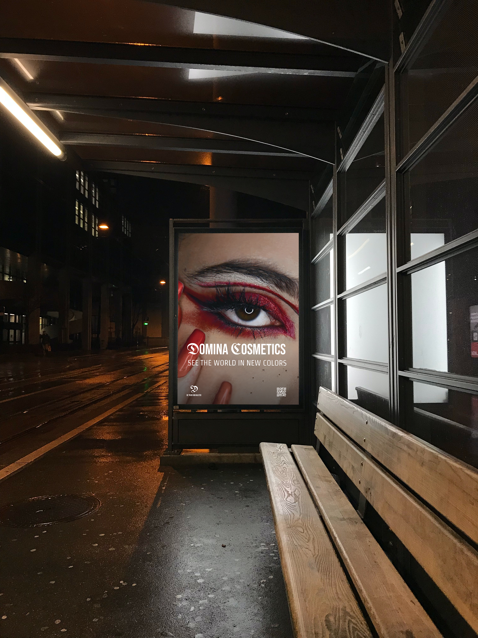
Domina is all about confidence, dominance, creativity. That's what is needed to be shown in the pictures. Since photography is a huge part in the brand's visual language it needs to be done properly. The red color is always a big part, and it's better to minimize the rest of the colors as much as possible. The shots taken are usually portraits or extreme close ups. Models ARE NOT ALLOWED TO BE SHY - let them make different face expressions, show anger, confidence, playfulness, smudge their makeup and even eat it if they need to. Basic pictures are not allowed.
Typography:
The titles should always appear in ALL CAPS in order to embody the screaming nature of the brand. The fonts used are Bebas Neue and UnifrakturMaguntia. A combination of the two required to make the titles less basic, but also not too freaky.
The titles should always appear in ALL CAPS in order to embody the screaming nature of the brand. The fonts used are Bebas Neue and UnifrakturMaguntia. A combination of the two required to make the titles less basic, but also not too freaky.
The font used for running text in both printed and digital products is Strait.
